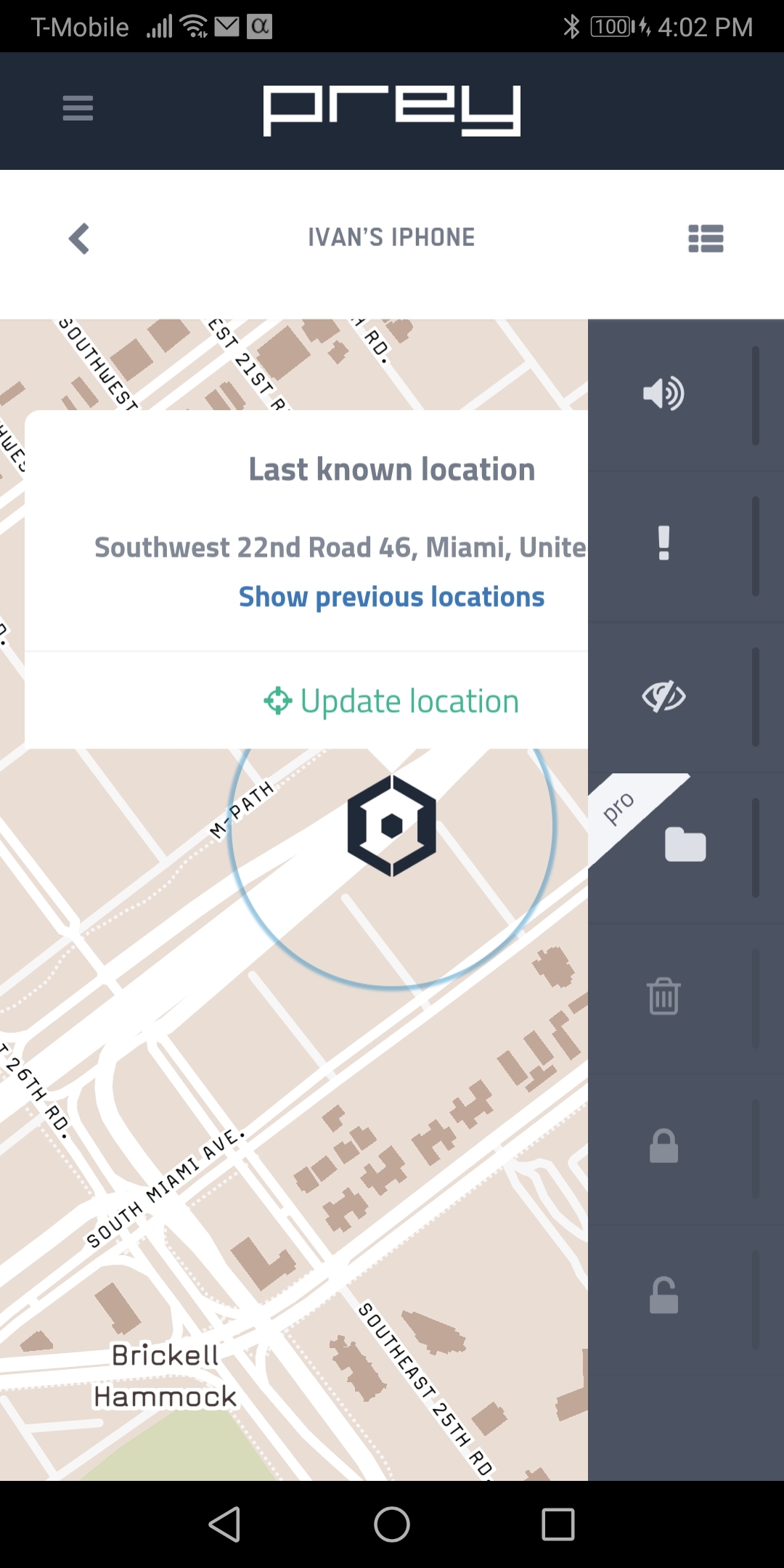
Hello. The box that contains the “update location” information, Last Known Location, is HUGE. It covers more than 1/3 of the cellphone screen. I imagine this is the same for all cellphones. Is there a way to minimize it or even remove it? Alternatively, could prey team work on making the box just a small reference that when clicked it pops up relevant information?
The point being, making it our of the way. It is hard to read the map, otherwise. The same issue is with the menu on the right hand side. It eats up a lot of useful real estate.
Thank you for this application. It is really useful.
Robert

